Table of Contents:
The Split: When Google Surfaces Shopping-First SERPs vs. AI Overviews for Product Queries?
Queries That Trigger Shopping-First SERPs
Queries That Trigger AI Overviews
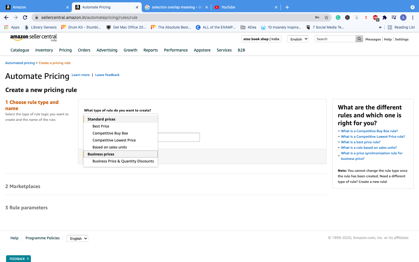
Amazon SEO Is Changing: From A10 Signals to AI-Led Visibility
Amazon SEO Strategies: Key Strategies for Amazon Sellers to Rank in AI Overviews
1. Structure Listings Around Search Intent
2. Align Keyword Strategy with Shopper Intent
3. Strengthen Product Data Enrichment Across Listings
4. Use Multimodal Content to Improve AI Visibility
5. Build Authority Beyond Amazon
Are your Amazon SEO strategies optimized for Google AI Overviews — or for a search experience that’s quietly becoming obsolete?
Product research today doesn’t begin with a marketplace search bar; it begins with a natural-language query that Google answers through AI Overviews — comparing options, evaluating fit, and narrowing choices before a shopper ever reaches Amazon. For sellers, this means listing optimization that supports AI-led discovery now determines whether you’re even in the consideration set.
This blog breaks down how AI Overviews are reshaping Amazon SEO strategy, when Google surfaces Shopping results versus AI Overviews, which strategies now carry the most weight: search-intent alignment, product data enrichment, multimodal content, and off-Amazon authority, and how an Amazon SEO agency helps.
The Split: When Google Surfaces Shopping-First SERPs vs. AI Overviews for Product Queries?
Queries That Trigger Shopping-First SERPs
Shopping-driven SERPs typically appear for commercial or transactional queries, where the search intent is focused on evaluating product options through price, attributes, availability, and seller information.
Typical query structures include:
Product Category + Price Qualifier
- Sneakers for women under $500
- Best laptop under $100
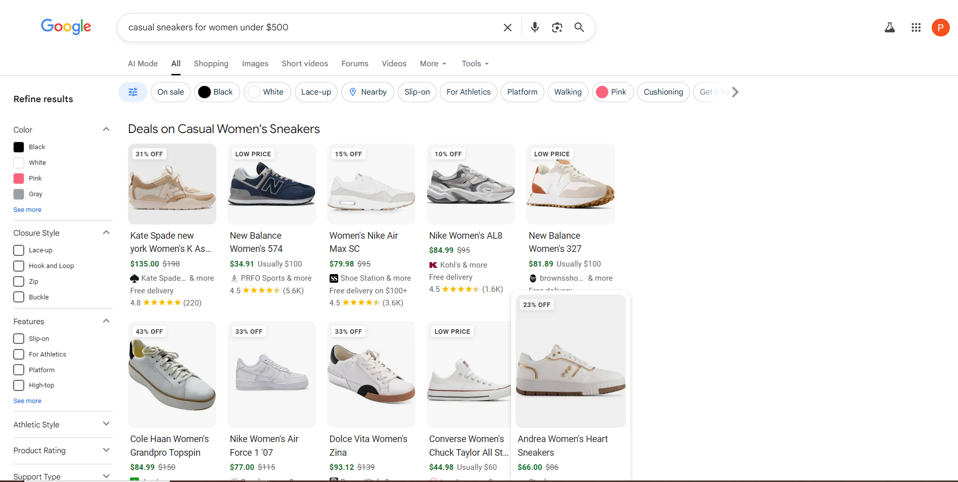
Attribute-Based Queries
- Black casual sneakers for women
- Waterproof hiking boots men
High-Intent Commercial Queries
- Buy air fryer online
- 4K smart TV deals
Queries That Trigger AI Overviews
| While AI Overviews are highly effective at summarizing consensus information, they lack the necessary visual and contextual data (like maps, reviews, and action buttons) required for high-intent shopping and real estate decisions.
– Semrush |
|---|
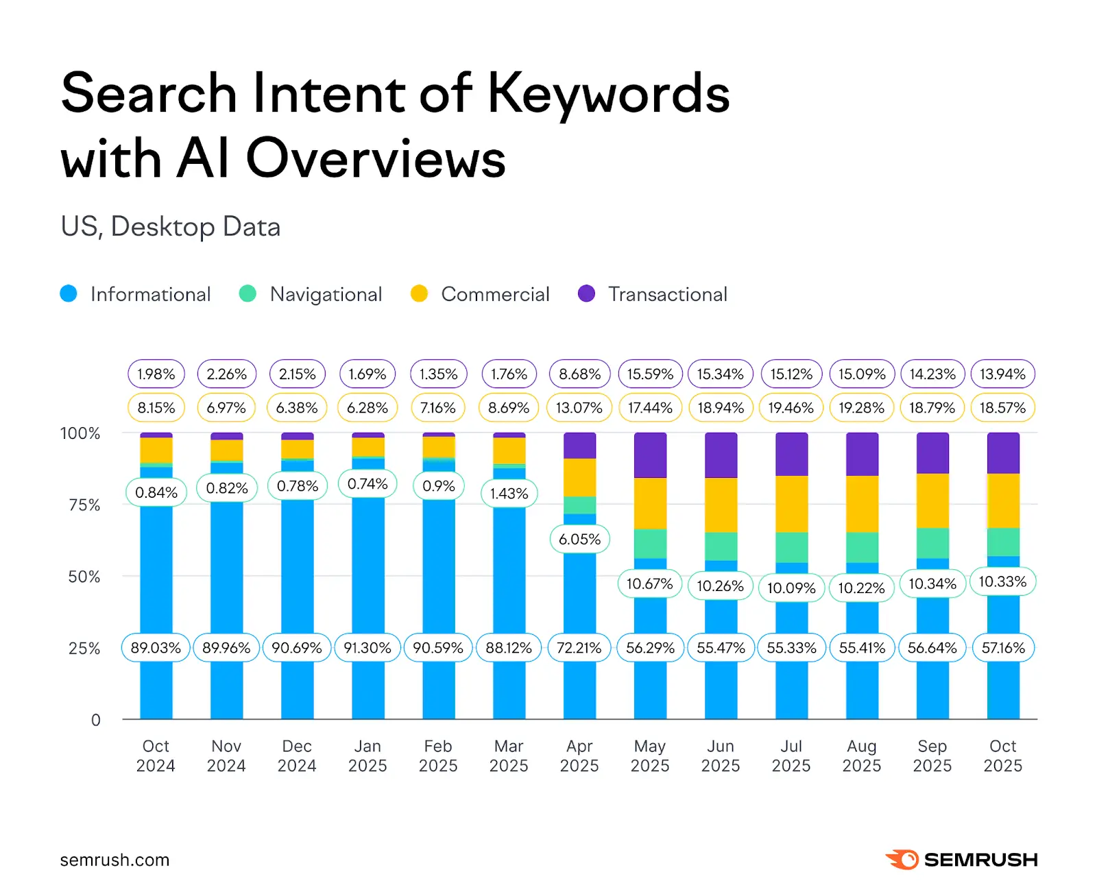
[Source: Semrush| AI Overviews Study]
Queries that trigger AI Overviews are predominantly informational, where the objective is to resolve complex research needs—such as comparisons, how-to guidance, or detailed product evaluation—within a single response layer.
Common query patterns include:
Specific Use-Case
- Best sneakers for long walking hours
- Best shoes for nurses with flat feet
Problem-Solution
- Which shoes are good for plantar fasciitis
- What type of sneakers are best for travel
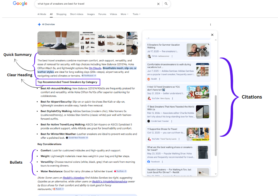
Structure of an AI overview result
Comparison-Based
- Nike vs Adidas for daily wear
- Running shoes vs training shoes
Decision-Support
- How to choose sneakers for wide feet
- What to look for in gym shoes
| Note: AI Overviews may not yet dominate high-intent queries, but that should not be mistaken for permanence. Semrush reports a growing share of commercial, transactional, and navigational keywords now triggering AI Overviews, pointing to a broader shift already underway. For sellers, this is the window to prepare for the next phase of search visibility. |
|---|
Amazon SEO Is Changing: From A10 Signals to AI-Led Visibility
While the A10 algorithm is still a crucial factor for search performance, there’s a second evaluation layer for AI search ranking, which considers how well a listing can be interpreted, contextualized, and surfaced for a query.
AI-Driven Evaluation Signals:
- Intent Alignment: How clearly does the listing correspond to specific use cases and search contexts?
- Product Data Enrichment: How comprehensively does the listing capture product specifications, taxonomy, and structured attributes?
- Content Consistency: Alignment across title, bullets, A+ Content, and backend data.
- Comparison Support: How effectively the listing presents attributes that help evaluate competing options.
- E-E-A-T Signals: Reputable brand presence, customer reviews, authoritativeness, and trustworthiness.
Amazon SEO Strategies: Key Strategies for Amazon Sellers to Rank in AI Overviews
1. Structure Listings Around Search Intent
When product data is structured around shopper intent, use cases, and differentiators, it makes it easier for AI systems to interpret product relevance to the search query.
- Lead bullet points with the core customer benefit, followed by the supporting feature or specification.
- Use A+ Content to address purchase considerations, usage scenarios, and product differentiation in a clearly segmented format.
- Add comparison charts where shoppers are likely to evaluate alternatives within the same category.
- Remove generic, repetitive, or overly promotional copy that reduces clarity.
2. Align Keyword Strategy with Shopper Intent
Instead of optimizing product descriptions for exact-match keywords, align them with natural language queries. This increases the likelihood of being surfaced within AI-generated responses for long-tail, conversational, and natural-language product searches.
- Front-end copy should reflect use-case terms, audience qualifiers, and problem-solving language that align with real shopper search behavior.
- The listing should address decision-stage factors, including suitability, compatibility, usage constraints, and application context.
- Keyword strategy should extend beyond short-tail terms to include long-tail and natural-language product queries.
- Backend search terms should reinforce coverage across synonyms, alternate naming conventions, and related search variants.
3. Strengthen Product Data Enrichment Across Listings
Structured and comprehensive product data remains a core requirement for discoverability, filtering, and comparison.
- Expand specification coverage across size, material, dimensions, compatibility, and performance attributes.
- Maintain accurate taxonomy placement and attribute mapping.
- Standardize structured attributes across related products and variations.
- Ensure the listing contains enough detail to support both refined search queries and comparative evaluation.
| Product Data Fields | Raw Product Data | Enriched Product Data |
|---|---|---|
| Product Title | Stainless Steel Water Bottle | 32 oz Stainless Steel Insulated Water Bottle, Leakproof, BPA-Free, for Hiking, Gym, and Travel |
| Specifications | Steel bottle | 32 oz capacity, double-wall vacuum insulation, food-grade stainless steel, leakproof lid, BPA-free |
| Attributes | Color: Black | Color: Black; Capacity: 32 oz; Material: Stainless steel; Insulation: Double-wall; Lid Type: Leakproof screw cap |
| Use Case Information | Suitable for daily use | Designed for hiking, commuting, gym use, and long-duration temperature retention |
| Compatibility / Differentiators | Keeps water cold | Keeps beverages cold for 24 hours and hot for 12 hours; fits standard car cup holders |
| Category / Taxonomy | Kitchen bottle | Sports & Outdoors > Outdoor Recreation > Camping & Hiking > Hydration & Water Bottles |
| Search Readiness | Limited keyword and filter relevance | Stronger relevance for filtered search, long-tail queries, and product comparison |
4. Use Multimodal Content to Improve AI Visibility
AI-driven discovery increasingly relies on more than listing text alone. Images, overlays, captions, and video descriptions all contribute to how product information is interpreted, validated, and summarized.
- Infographic-style images should highlight key specifications, compatibility details, dimensions, and other differentiators that support faster product interpretation.
- Text overlays should reinforce important product attributes and remain consistent with the claims made across the rest of the listing.
- Video content should demonstrate product application, functionality, and use-case context, while captions and descriptive transcripts should be included to improve interpretability.
5. Build Authority Beyond Amazon
To cite on Google AI Overviews, a structured and optimized Amazon listing alone is not enough. Product information is more likely to be cited when it is supported by credible brand-owned content and consistent third-party references.
- Publish product comparison pages, buying guides, and technical product information on brand-owned digital properties.
- Support product claims with expert-backed, evidence-based, or experience-led content where relevant.
- Maintain consistency in product specifications, positioning, and brand messaging across Amazon listings, the brand website, and external references.
- Strengthen brand presence across reputable third-party sources that influence trust, authority, and citation likelihood.
The Strategic Imperative: Ranking listing for AI-led product discovery demands more than isolated listing optimization. It requires brands to consider all aspects simultaneously, including intent alignment, product data enrichment, structured content, visual assets, and off-Amazon authority. Most in-house teams cannot offer these capabilities with the same depth, speed, or scale.
An Amazon SEO agency offers the field-level expertise, specialized infrastructure, and scalable resources to handle these more efficiently and often more cost-effectively than building the same capability in-house.
Author Bio
Sophie Hayes is an eCommerce consultant and a keen blogger, currently working at Team4eCom (a reliable Full-Service eCommerce Agency). With over optimization, and product listing. Moreover, she has a great knowledge of the leading eCommerce platforms and marketplaces like Amazon, eBay, Walmart, Target, and others. She incorporates this understanding in her write-ups to help online retailers and businesses follow the best practices, take their business to new heights, and gain a grounded footing in the market.