
A website is more than pages stitched together; it is a place where orientation, credibility, and momentum quietly decide outcomes. In the first moments of a visit, design determines whether people understand where they are, believe what they see, and feel guided toward the next step. This article explores website design through three practical lenses-clarity, trust, and flow-so that every element earns its keep. Clarity is the foundation. It makes purpose obvious, reduces cognitive load, and turns complex offerings into legible pathways. Trust is the signal that what’s presented is reliable and safe, conveyed through consistency, accessibility, performance, and transparent choices.
Flow is the sense of effortlessness as visitors move from interest to action, sustained by thoughtful navigation, hierarchy, and microinteractions that remove friction rather of adding flair for its own sake. What follows is a set of principles and techniques to align content, structure, and interface with human expectations. We will translate abstract ideas-like visual hierarchy and affordance-into concrete decisions about language, layout, and behavior. The goal is not decoration or novelty. It is indeed to build a site that explains itself, keeps its promises, and carries people forward without confusion. In other words: design that is clear, trustworthy, and in flow.
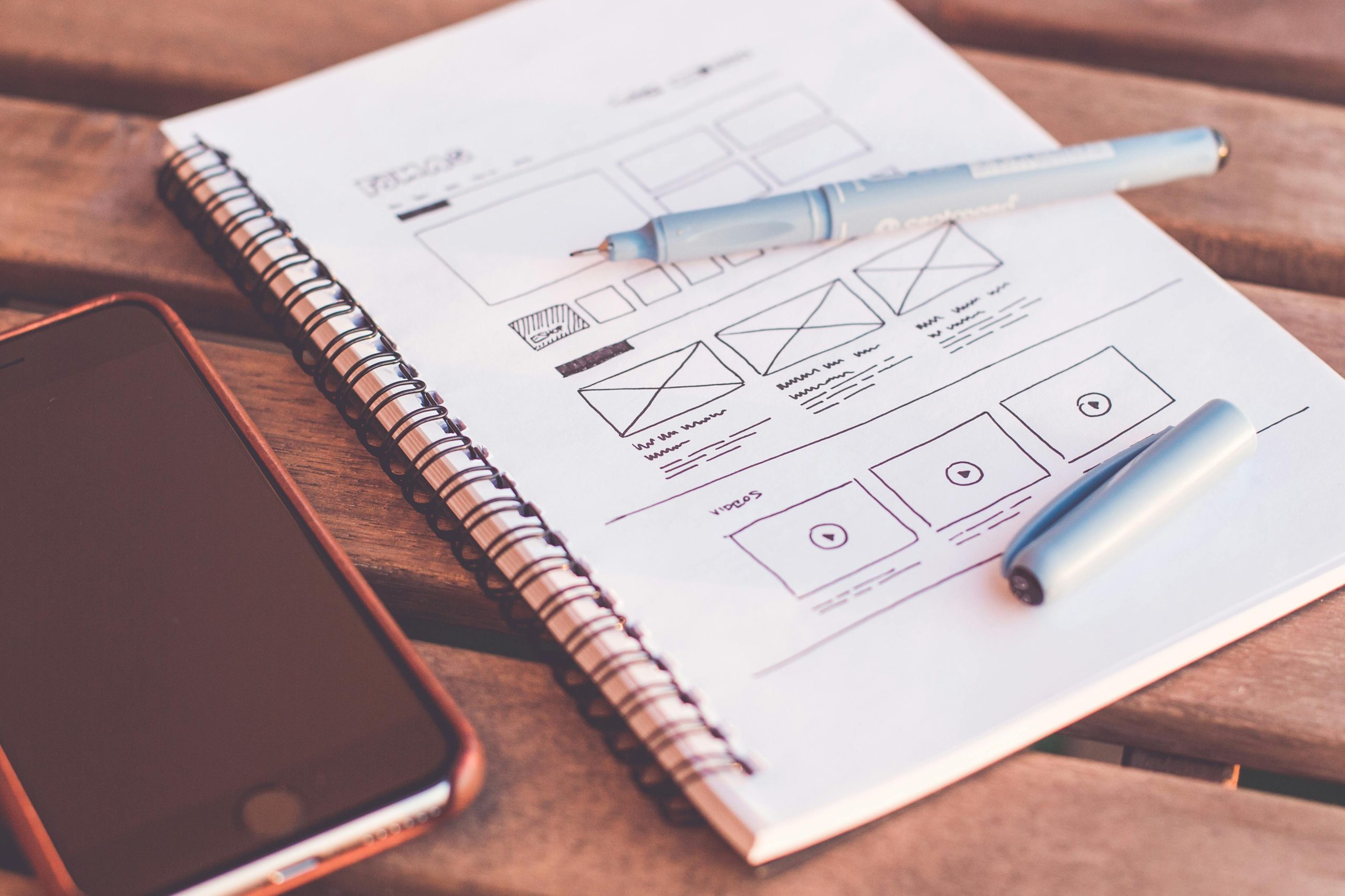
Make Purpose Obvious With a Focused Headline a Single Primary Action Clear Hierarchy and Plain Language
Lead with intent that a visitor can grasp in a heartbeat: a compact headline that names the outcome, followed by one unmistakable button that carries the momentum forward. Strip away competing choices, demote nice‑to‑have links, and let whitespace guide the eye to the next step. Treat each pixel as a nudge toward the goal-short, active verbs, generous contrast, and microcopy that answers “why this, why now.”
- Headline Focus: Outcome over features (“Get paid faster”).
- Primary Action: One button, one verb (“Start free”).
- Support: A short subline that reduces risk (“No card needed”).
- De-emphasize: Secondary paths as quiet text links.
| Element | Weak | Clear |
|---|---|---|
| Headline | Solutions for Success | Send Invoices in Seconds |
| Button | Learn More | Try It Now |
| Subcopy | We Strive to Provide Value | No Setup. Cancel Anytime. |
Hierarchy turns clarity into flow. Use size, weight, and spacing to create a reading path: headline, one-sentence value, proof, then action. Keep language plain-swap jargon for everyday words, prefer short sentences, and surface the next decision at exactly the right moment. Group related items, cap section lengths, and keep icons literal. When everything looks important, nothing is; when structure breathes, trust rises and clicks follow.
Build Trust Through Transparent Pricing Authentic Photography Clear Policies and Visible Security
Trust is ergonomic: the less a visitor has to wonder, the faster they relax into action. Reveal full costs early (including taxes and shipping), avoid footnotes in tiny gray text, and use real photography that shows scale, context, and people interacting with your product or service. Short, human policy summaries right where decisions happen-returns beside the “Buy” button, data use beside a newsletter field-turn legal obligations into confidence boosters. And when sensitive data is involved, don’t hide your safeguards; display encryption details, verification badges, and uptime status so visitors can see you take their safety seriously.
- Transparent Pricing: Show totals before checkout, clarify renewals, and highlight what’s included vs. optional.
- Authentic Visuals: Use real teams, real customers, and in-situation shots; label edits; provide alt text for clarity.
- Plain-language Policies: Add a TL;DR with key points (window, costs, timeframe, exceptions) and link to the full text.
- Visible Security: Place trust badges near forms, name your provider (e.g.,TLS 1.3), and state how data is handled.
Design for clarity with intentional placement: pricing breakdowns near plan selectors, policy snippets in tooltips and accordions, and security notes exactly where input happens. Pair these elements with microcopy that answers the question before it’s asked-“Cancel anytime,” “Free 30‑day returns,” “We never store full card numbers”- and support it with consistent visuals and a layout that makes truth easy to see.
| Element | Best Practice | Example Microcopy |
|---|---|---|
| Pricing | Show All Fees Upfront | Total Today: $49 (No Extra Fees) |
| Photos | Real People & Real Settings | Shot On-site; No Stock Edits |
| Policies | TL;DR Summary + Details | Returns: 30 Days, Free, No Forms |
| Security | Badge + Specifics Near Forms | Encrypted via TLS 1.3; PCI Compliant |
Design for Speed and Device Diversity With Performance Budgets Optimized Images Responsive Layouts and Touch Friendly Targets
Speed is a promise your interface keeps on every network, from spotty transit Wi‑Fi to fiber at home. Anchor that promise with a performance budget and design choices that respect it: fewer requests, smaller payloads, and predictable rendering. Think of bytes as calories-every component must earn its place. Use priority hints and preconnect for critical paths, defer non-essentials, and practice progressive enhancement so the page remains usable before all frills arrive. On image-heavy views, apply art direction and modern formats to keep visual storytelling crisp without bloat, and let layout strategies adapt fluidly so content stays legible at every breakpoint.
| View | LCP | Total JS | Images | Req. |
|---|---|---|---|---|
| Home | <2.0s | <150 KB | <300 KB | <40 |
| Listing | <2.5s | <180 KB | <450 KB | <55 |
| Article | <2.0s | <120 KB | <350 KB | <45 |
Deliver clarity across phones, tablets, and large displays with fluid grids, container queries, and typography that scales by viewport and prefers system fonts for instant paint. Use AVIF/WebP, srcset and sizes, intrinsic width/height, and lazy-load below-the-fold media; in WordPress, wp_get_attachment_image() outputs responsive sources and core adds loading="lazy" by default. Keep tap targets generous (≈44-48px), add 8-12px spacing, avoid hover-only controls, and provide obvious focus states. Trim JavaScript with code-splitting and block-level conditional loads; in block themes, govern spacing and typography via theme.json to reduce custom CSS. When you must choose between flourish and flow, choose flow-fast, readable, and thumb-friendly wins.
- Speedy Image Wins: Compress to visual parity, prefer
AVIF/WebP, serve DPR-aware variants, lazy-load non-critical carousels. - Layout Resilience: Reserve space to prevent CLS, use
aspect-ratio, and enablecontent-visibility: auto;for long lists. - Touch Comfort: Minimum 44px targets, no tiny icons without labels, and avoid edge-to-edge taps near OS gestures.
- WordPress Specifics: Dequeue unused block styles, bundle icons as SVG sprites, leverage Performance Lab for image optimization, and audit with Query Monitor.
Guide Flow With Clear Affordances Helpful Microcopy Inline Validation and Friction Free Paths
Clarity emerges when every control looks and behaves like what it is: links read as links, buttons feel pressable, and fields hint at what belongs inside. Pair these visual cues with concise microcopy that answers the user’s unspoken “why” and “what happens next?” In-the-moment inline validation trims rework by confirming good input and flagging issues before submission, while friction‑free paths reduce choices to the next best step, not every possible step.
- Make Actions Obvious: High‑contrast buttons, clear hit areas, consistent states.
- Write Verb‑first Labels: “Save changes,” “Create account,” “Get updates.”
- Place Help Where It’s Needed: Under fields, beside toggles, near consequences.
- Validate as You Type: Confirm success, explain errors, suggest quick fixes.
- Show Progress: Simple steps, what’s done, what’s next, how long it takes.
- Prefer Guardrails to Blockers: Undo, autosave, smart defaults over hard stops.
Design the journey like a conversation: each state asks a focused question, each response narrows uncertainty, and the interface guides without shouting. Tie affordances to intent (primary vs. secondary), draft reusable microcopy patterns, and define crisp validation messages that teach, not scold. Then test the flow: time‑to‑first‑success, error recovery rate, and drop‑off by step reveal where “invisible friction” hides. Trim steps, combine decisions, and let confident users move fast while careful users never feel rushed.
| Pattern | Affordance Cue | Microcopy | Validation | Path Simplifier |
|---|---|---|---|---|
| Email Signup | Filled CTA | Get Updates | “Use a Valid Email” | One Field |
| Shipping Form | Field Masks | “As on Mail Label” | Live Postcode Check | Auto‑complete |
| Password | Strength Meter | “3 Words,12+ Chars” | Inline Hints | Show/Hide Toggle |
| Checkout | Primary Button | “Pay Securely” | Card Type Detect | Guest Flow |
Final Thoughts…
Website design is a quiet contract: you make it easy to understand, safe to proceed, and simple to continue. Clarity removes guesswork, trust reduces risk, and flow turns intent into action. When those three align, visitors don’t have to think about the interface-they can think about what they came to do. Treat it as a practice, not a phase. Set a clear purpose, let content lead, choose patterns you can repeat, write what people would actually say, respect accessibility, measure what matters, and keep the experience fast. Friction becomes a signal, not a failure; iteration becomes your method. A site built on clarity, trust, and flow doesn’t compete for attention. It listens, guides, and gets out of the way. Every click is a small promise kept-and that, more than any flourish, is what keeps people moving forward.

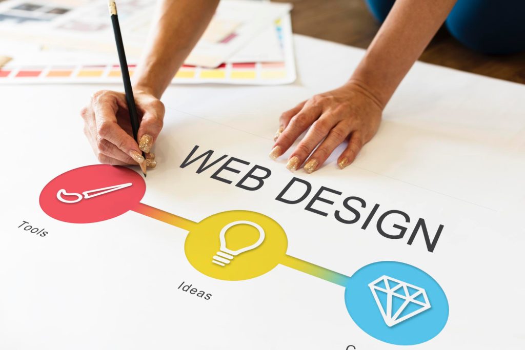
 In the digital age, a website is more than just a virtual address — it’s the first handshake, the initial glance, and often the lasting impression a brand leaves on its audience. Crafting clear and engaging website designs that connect is both an art and a science, blending visual appeal with intuitive functionality to create experiences that resonate. This delicate balance transforms browsers into believers, inviting users not just to visit, but to stay, explore, and engage. In this article, we’ll explore the key elements and thoughtful strategies behind designing websites that speak clearly and connect meaningfully with their visitors.
 In a world where online presence is crucial for businesses to thrive, the art of website design plays a pivotal role in attracting and engaging users. Crafting compelling digital experiences is a delicate balance of aesthetics, functionality, and user experience. Join us as we delve into the wonderful world of website design and explore the key elements that make for a successful online presence.